
Key Takeaways
- Empty states should explain why content is missing and guide users toward the next step.
- Tailor messages to first use, no results, completed tasks, or temporary errors.
- Clear copy and one primary action help users make progress without confusion.
- Purposeful visuals, mobile-friendly layouts, and accessible controls improve usability.
- Testing user behavior and tracking meaningful outcomes help teams refine empty-state designs.
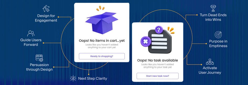
An empty screen is rarely a neutral moment. When people cannot tell whether content is missing, still loading, or simply unavailable, they may hesitate or leave the feature altogether. Reviewing strong empty state UI examples can help teams see how a short explanation and a focused action turn an otherwise blank area into useful guidance.
Well-designed empty states explain the user’s situation, clarify what normally belongs on the screen, and offer an appropriate next step. The right treatment depends on why the space is empty. A new account, a failed search, a completed queue, and a connection problem should not all receive the same message.
Table of Contents
- Why Empty States Matter
- Identify the State
- Write Clear, Useful Copy
- Choose the Right Next Action
- Use Visuals With Purpose
- Design for Mobile Screens
- Support Accessibility
- Test and Measure the Experience
- Common Mistakes
- Practical Checklist
Why Empty States Matter
A blank content area forces users to interpret the product on their own. They may wonder whether they made an error, whether the app is working, or what they are expected to do next. An empty state replaces that uncertainty with context. It can introduce a feature, acknowledge a completed task, help someone revise a search, or explain how to recover from a problem.
Empty states deserve the same design attention as populated screens because users often encounter them first. They are part of the product flow, not a fallback added after the main interface is complete.
Identify the State Before Designing It
Start by identifying the cause of the empty screen. The reason should determine the message, tone, and available action.
- First-use state: The user has not created, saved, or added anything yet.
- No-results state: A query or filter does not match available content.
- Completed state: The user has finished a list, inbox, queue, or set of tasks.
- Removed-content state: Items were deleted, archived, or cleared.
- Unavailable state: Content cannot appear because of a permission, connection, configuration, or system issue.
For example, a new project area may need a “Create your first project” button. A completed task list may only need a positive confirmation such as “You’re all caught up.” The first case asks users to begin; the second confirms that no action is required.
Write Clear, Useful Copy
Begin With the User’s Situation
Use plain language to say what is happening and what normally appears in that space. “No saved items yet” is more helpful than “Nothing here” because it names the missing content. Avoid internal product terms, vague wording, and messages that imply the user did something wrong.
Use a Simple Three-Part Message
- Headline: Name the current state.
- Supporting text: Explain what users can expect or why the area is empty.
- Action: Offer the most useful next step, if one exists.
Keep copy short enough to scan. For a saved-items screen, write: “No saved items yet. Save products to find them here later. Browse products.” For search, write: “No results for ‘wireless lamp.’ Try another term or remove a filter.” For a project screen, write: “Start your first project. Add tasks, files, and teammates in one place. Create project.”
Choose the Right Next Action
Not every empty state needs a button. The action should reflect the user’s goal and the cause of the state. When an action is useful, prioritize one clear primary path.
- Create: Add a first task, note, project, or item.
- Search again: Edit a query, clear filters, or broaden criteria.
- Invite: Add a teammate or contact where collaboration is essential.
- Retry: Request content again after a temporary failure.
- Learn: Open brief guidance when the feature needs explanation before action.
Multiple competing buttons can make a simple screen feel demanding. If several routes are possible, select the one most likely to help users make progress and present other options with less visual emphasis.
Use Visuals With Purpose
An icon, illustration, or sample item can make an empty state easier to recognize, but it should support the message rather than replace it. Use simple visuals for states people may see frequently, such as empty searches. Reserve richer illustrations, starter content, or brief educational cues for first-use moments when people need to understand a feature’s value.
The different empty-state treatments described by Carbon Design System also reinforce an important principle: first-use, user-action, and error situations need distinct levels of explanation. A visual should fit the seriousness and frequency of the state.
Design for Mobile Screens
Keep the Layout Focused
On a phone, place the message where it is easy to notice without crowding navigation or persistent controls. Use a short headline, a compact supporting paragraph, and comfortable spacing around the primary action. Check narrow and wide phone widths, portrait orientation, and enlarged text settings.
Respect Touch and Reach
Make interactive elements visibly actionable and easy to tap. The minimum target-size guidance in WCAG 2.2 emphasizes providing adequately sized controls or enough spacing around smaller ones. A desktop-style empty state with a large illustration, long paragraph, and several inline links can become cramped on a narrow screen. Simplify it to one message and one obvious action.
Support Accessibility From the Start
Text must communicate the state even when images, color, or animation are unavailable. Give controls descriptive labels such as “Create a project” instead of “Continue.” Maintain readable contrast, preserve a logical reading order, and ensure screen readers announce both the message and the action.
Error and unavailable states need particular care. Explain what happened in plain language, state whether users can fix it, and provide a practical next step such as retrying, checking permissions, or contacting an administrator. Accessibility should be built into the empty-state component, not treated as a final review item.
Test and Measure the Experience
Test the whole transition, not just the empty screen. Ask participants to open the feature as a new user, explain what the message means, take the suggested action, and confirm that the resulting populated screen reflects their progress. Then revisit the empty state to ensure its meaning still fits.
- Primary action tap rate.
- Time from empty-state view to a successful action.
- Search reformulation rate for no-results screens.
- Retry success rate for unavailable content.
- Drop-off before a first meaningful action.
A high tap rate alone is not proof of success. The action should lead to a useful result, such as a created item, a completed setup step, or a successful search.
Common Empty State Mistakes
- Using the same generic message for every empty condition.
- Designing populated screens first and treating empty screens as an afterthought.
- Adding decorative artwork without explaining what users should do.
- Offering too many equally prominent actions.
- Sounding blaming or dismissive in no-results messages.
- Making a loading state look identical to a permanent lack of content.
- Using an elaborate layout for states that repeat often.
Practical Empty-State Checklist
- Can users tell why the screen has no content?
- Does the copy explain what normally belongs there?
- Is the next step clear and appropriate?
- Is there one primary action when action is needed?
- Does the layout remain usable on small screens and with larger text?
- Can a screen-reader user understand and complete the flow?
- Are loading, empty, and error conditions clearly different?
- Does the populated state confirm that the user made progress?
Final Thoughts
Empty states should never feel like dead ends. A clear explanation, concise copy, purposeful visual treatment, and focused next step can turn an empty screen into a useful part of the mobile experience. Design for the reason the space is empty, then help users move forward with confidence.
